1.2M or 1,234,567? How we format numbers
Three significant digits, decimals that mean something and a real minus sign.

On this page
Should a chart say 1,234,567 or 1.2M? Should a percentage have one decimal or none? These sound like tiny decisions. In an analytics tool they are on every screen, and getting them wrong makes people misread their own data. Here are the rules we settled on.
Round for reading, keep the detail for hovering
People compare numbers on a chart; they rarely need every digit. "1.2M visits" is easier to read and remember than "1,234,567 visits". So Tally rounds numbers in charts and summaries, and shows the exact number when you hover or export.
Our rule: show three significant digits at most. 1,234 stays 1,234. 12,345 becomes 12.3k. 1,234,567 becomes 1.23M.
Decimals that mean something
A conversion rate of 3.4721% suggests a precision the data does not have. With a few thousand visitors, the true rate could easily be anywhere between 3% and 4%. We show one decimal for percentages under 10%, and none above.
| Raw value | Shown in Tally |
|---|---|
| 3.4721% | 3.5% |
| 47.38% | 47% |
| 0.0412% | 0.04% |
| 1,234,567 | 1.23M |
Very small percentages keep enough digits to stay non-zero. Showing "0%" for something that happened forty times is a lie.
Every extra digit asks the reader for attention. Make sure it gives something back.
Tom Becker
Typography
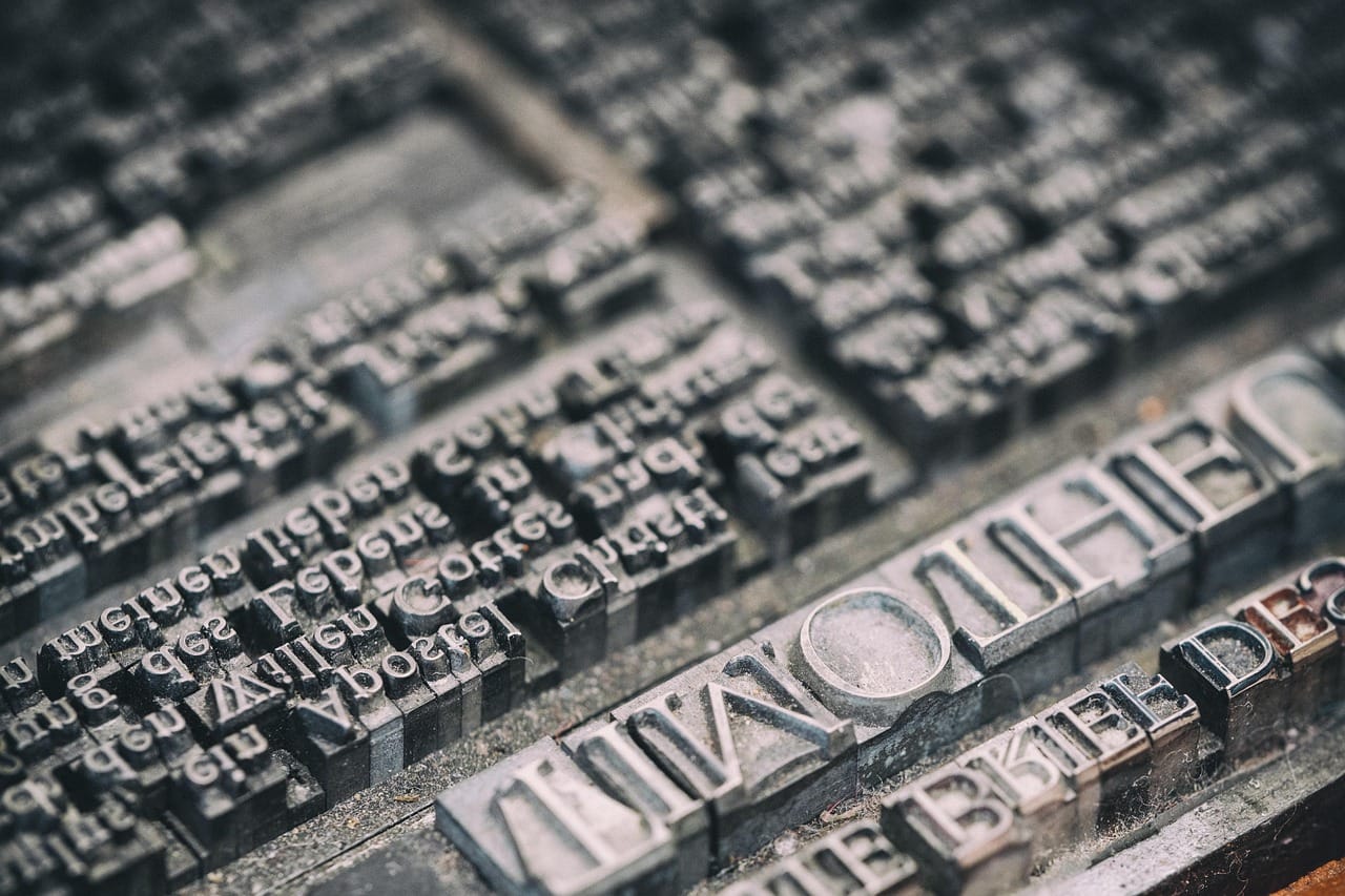
Numbers in tables use tabular figures: every digit has the same width, so a column of numbers lines up and the eye can compare them. Numbers in sentences use normal figures, which look better in text.
We right-align numbers in tables, so units line up with units and thousands with thousands. Text is left-aligned. This one change made our tables noticeably easier to scan.
Local formats
A thousand and a half is written 1,500.5 in the United States and 1.500,5 in Germany. Tally follows the language setting of each user's browser, so the same chart reads naturally in Berlin and in Boston. Exports always use a plain format that spreadsheets understand.
Changes and differences
When we show a change, we always show the sign: +12% or −8%. We use a real minus sign, not a hyphen, because it is the same width as the plus. Colour helps, green for up and red for down, but the sign does the work, for people who cannot tell the colours apart.